You are using an out of date browser. It may not display this or other websites correctly.
You should upgrade or use an alternative browser.
You should upgrade or use an alternative browser.
Stern Aerosmith pics are up
- Thread starter mwong168
- Start date
Chris Bardon
Well-Known Member
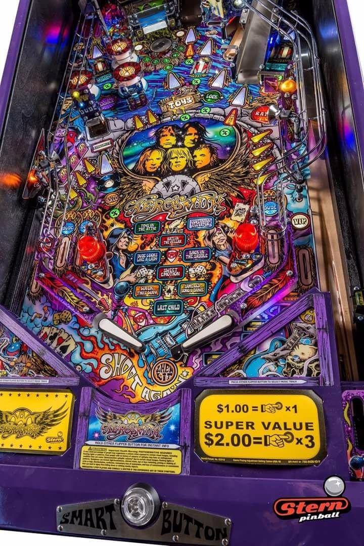
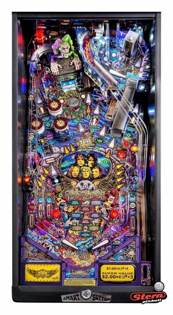
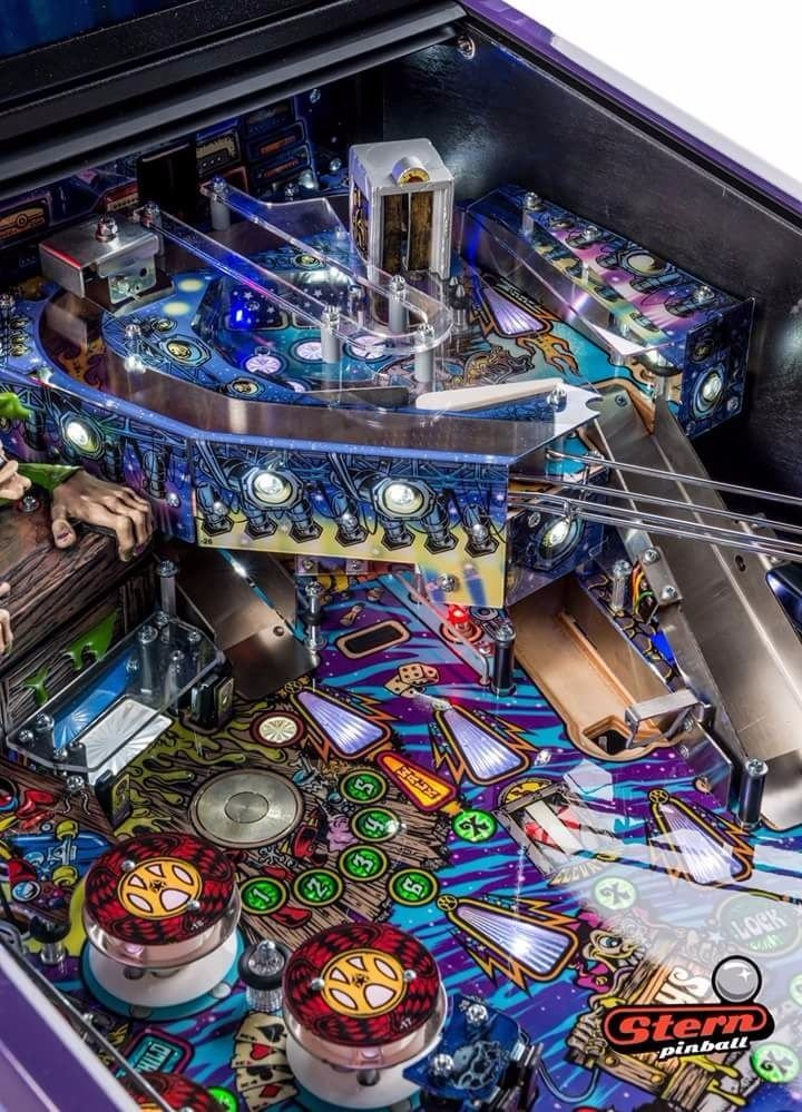
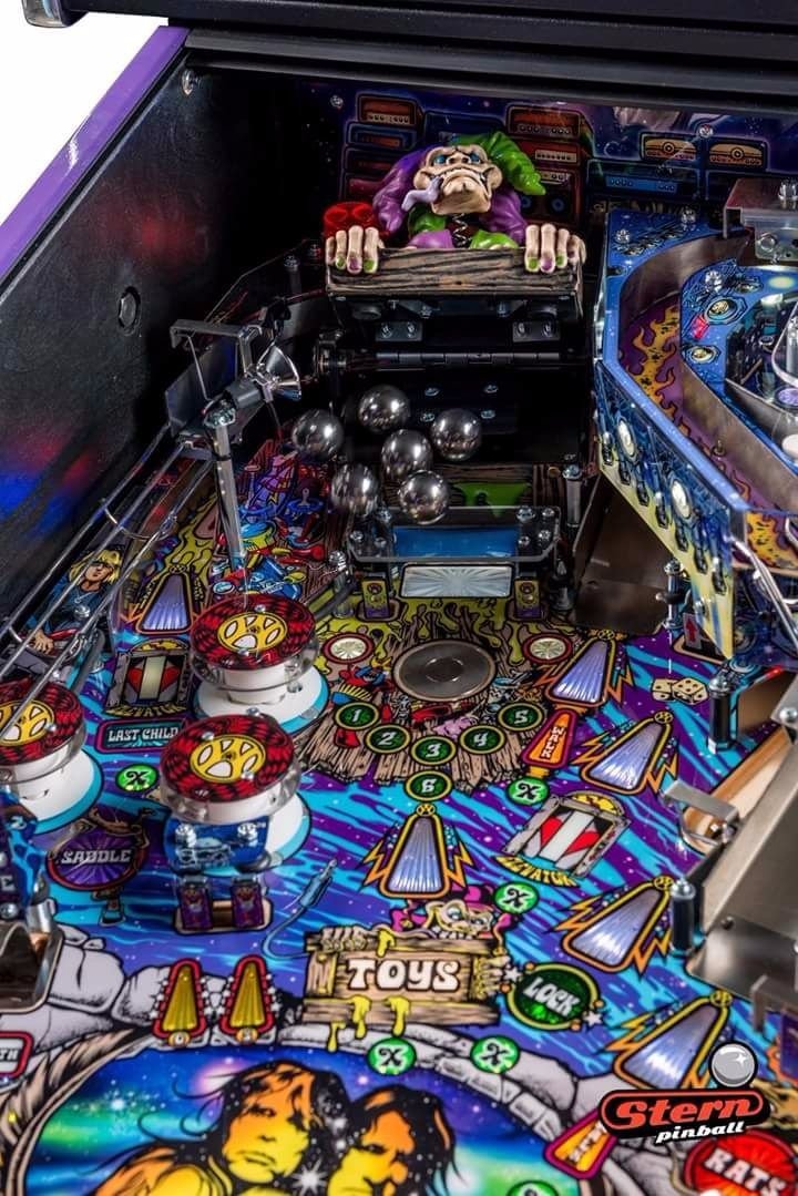
Looks interesting, but that upper PF seems incredibly basic. The lock mech seems like a really cool physical gimmick-from what I can tell the ball is supposed to kick up into the toybox from the other side of the PF? The lock release effect was neat in IJ4 though, so re-using it here makes sense.
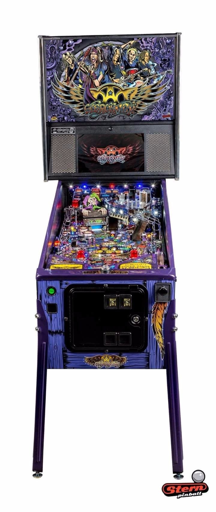
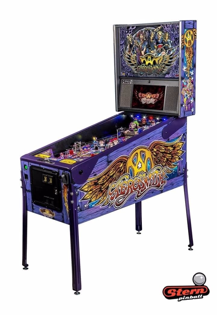
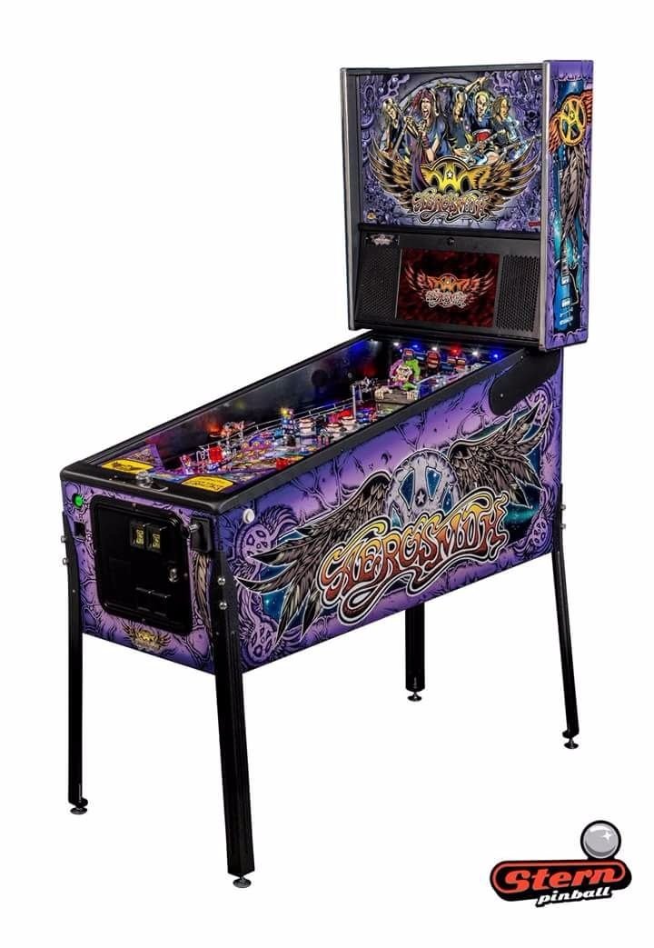
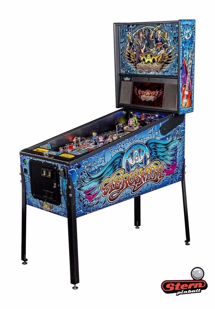
It's strange, but I never thought of Aerosmith as a band with a lot of iconography or visual style, but the game definitely looks stylish. Music is definitely solid though, just like ACDC and Metallica. Not sure about what I've seen of the LCD, but that's really going to take some time to come into its own. I know I like the way that JJP has used it to keep more information up on a HUD at once, while so far the Stern implementation seems to be "DMD+", with the display being used for pretty much one thing at a time. I have a feeling that this is going to evolve over the next few years as designers really figure out how to use the new tech, assuming that the Spike system can drive visually composed elements onto the screen.
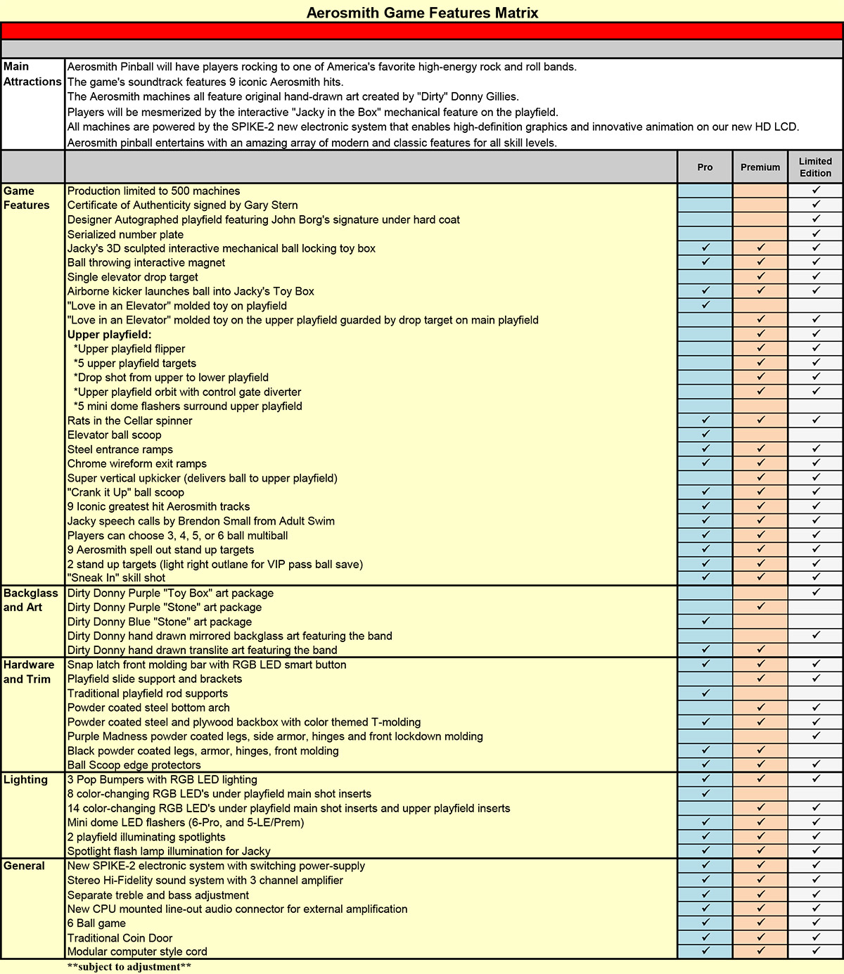
I was looking at the feature matrix last night, and there really doesn't seem to be as much of a difference between the pro and premium as usual. There's the upper PF obviously, but even the RGB lighting is the same across the board now. Get the pro and replace the posts with real support rails and you're set?
meegis
Well-Known Member
bstock
Active Member
Anybody else not a fan of this art style. I hear nothing but good things about this guy but that translite reminds me of a caricature sketch you get at wonderland or the ex by a guy sitting on stool for $20.
I was just thinking how happy I was to see some of this original art again. I think it's beautiful, and in my opinion it's what pinball should look like. I could go for other styles, but nice hand drawn art is the way to go. This is a breath of fresh air from the photoshop stuff IMO.
Sent from my iPhone using Tapatalk
Maybe thats it, I havent been around pinball long enough to be bored of the photoshop stuff.
Chris Bardon
Well-Known Member
Anybody else not a fan of this art style. I hear nothing but good things about this guy but that translite reminds me of a caricature sketch you get at wonderland or the ex by a guy sitting on stool for $20.
What do you think of the art on Metallica? Same artist, but I definitely get a little more of a Rat Fink feel from that game as opposed to Aerosmith. I like that they're trying something different, and are able to break with Photoshop style guides a little. Aerosmith went a little more psychadellic than I might have expected, but I've never been to an Aerosmith show, so no idea how apt it is for them. The art on Ghostbusters is also fantastic (and a little less caricatured), so maybe this represents a new trend for Stern?
Im a big metallica fan growing up with them in the late 80's and early 90's. My first concert actually and I was really dissapointed with the art on the pinball. I thought it was too jokey-cartoony for thier style. And Im not sure what relevence Sparky has to the band. Ghostbusters was a little less of a caricature and a bit nicer imo.
The artwork in the centre lower playfield of aerosmith really looks like a big every-color-in-the-palette mess. All thise bright colors are just competing with each other and all the details get lost in doing so. Although It may have a different feel in person.
The artwork in the centre lower playfield of aerosmith really looks like a big every-color-in-the-palette mess. All thise bright colors are just competing with each other and all the details get lost in doing so. Although It may have a different feel in person.
nics135
Member
Looks cool but are the rules and gameplay good? Kiss looked cool but do not see people lining up to get one of those. AC/DC pro had that stupid face in the middle but gameplay and rules overcame that mistake.
I am too stupid to tell from pictures or video if the machine will be fun or the rules any good. I love Big Buck Hunter so most people would not trust my judgement anyway. I will wait for Adam to give approval rating on rules and gameplay.
The ball flying into the toy box is a good gimmick though.
I am too stupid to tell from pictures or video if the machine will be fun or the rules any good. I love Big Buck Hunter so most people would not trust my judgement anyway. I will wait for Adam to give approval rating on rules and gameplay.
The ball flying into the toy box is a good gimmick though.
Pin-Balls
Member
Love Dirty Donny's style, was going to pass on this pin when I first heard about it, but I really do like the art, so I will give it a chance..
You can never tell how good a game is going to be just by looking at it. Only way to judge is to wait and play it.
D
D
DRANO
Super Member
I was lucky enough to be at CES today and got to speak with Gary Stern for a bit and played Batman and Aerosmith. Even managed to GC the premium they had in display.
I can't get into the details because I was just trying to keep up and follow along, but my initial thoughts were pretty positive... Of course, I had a great game, so that always helps sway one's opinion.
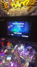
I can't get into the details because I was just trying to keep up and follow along, but my initial thoughts were pretty positive... Of course, I had a great game, so that always helps sway one's opinion.

scylla
Member
I'm with Dave on this- I think the artwork is beautiful on this title. Mind you, I'm also a big fan of the art on MET as well.
I think Stern is doing a great job on these art packages with GB an awesome looking pin as well. Also hope the gameplay is just as good...
I like the artwork as well - although I'm 100% sold on the LCD cartoons yet.
I wish they had put the same effort into the GOT art package. Great game - but the playfield is a clip art disaster. Such a lost opportunity...
Agreed with Scylia on the LCD cartoons- they are certainly under-whelmimg. I added the color Dmd on MET which IMO looks much better than the LCD cartoony images on AS, at least so far.
I own a GoT premium and would have liked a better art package as well; luckily the gameplay and rules are stellar.
I own a GoT premium and would have liked a better art package as well; luckily the gameplay and rules are stellar.

